
Power BI 100% stacked column chart is used to display relative percentage of multiple data series in Stacked columns, where the total (cumulative) of each Stacked columns always equals 100%.
This chart is particularly useful when you want to compare the relative proportions of subcategories within each category, while also emphasizing the cumulative effect of the entire category.
Let’s start with an example
Step-1. Download Sample data : SuperStoreUS-2015.xlxs
Step-2. Add 100% Stacked Column chart into Power BI Report page.
Step-3. Now, drag the relevant columns to the Fields section as shown in the image below for your reference.
- X-axis: ‘Region’
- Y-axis: ‘Sales’
- Legend: ‘Product Category’

How to formatting 100% Stacked Column Chart?
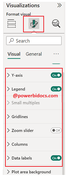
Select the chart > Click on “Format your visual tab”> From there, you can manage the properties listed below:
Visual Tab:
X-axis : Mange the X-axis Value font size, color & Title.
Y-axis: Mange the Y-axis Value font size, color and Title etc.
Legend: Specified the Legend Text color, font size, Position & Title.
Columns: Change the color of chart & maintain the spacing between columns.
Data Labels: Enable the data labels on chart, manage the display unit of labels
General Tab:
Properties: In this section you can manage the chart height, width, horizontal & vertical position.
Title: Under general tab you can see the title section> Here you can set the below properties-
-
-
- Title- Specified the title for chart, & manage the font size, color, background for chart.
- Subtitle- Specified the subtitle for chart, & manage the font size, color, background for chart.
- Divider- Enable the line between Title & chart.
- Spacing- Manage the space between title, Subtitle & chart area.
-
Key features of a 100% Stacked Column Chart in Power BI include:
- 100% Representation: Each column in the chart represents a category, and the segments within the column show the proportions of subcategories as percentages, summing up to 100% for each category.
- Relative Comparisons: This chart type is great for understanding the relative contributions of subcategories to the whole within each category. It highlights how the distribution changes across categories.
- Normalized View: Because each column represents 100%, the chart provides a normalized view that makes it easier to compare proportions.
- Color Coding: Different subcategories within each column are typically represented using distinct colors for better differentiation.
- Legend: The legend helps identify the individual subcategories.
- Tooltip: Hovering over a segment provides detailed information about the percentage it represents.
Hope you enjoyed the post. Your valuable feedback, question, or comments about this post are always welcome or you can leave us message on our contact form , we will revert to you asap.
Recommended Post:
![]()