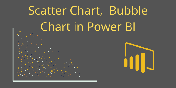
Scatter charts, also known as Bubble chart, shows the relationship between two numerical values.
Using two points of data we consider the chart a Scatter chart, when adding a third point of data then the chart will become a Bubble chart.
We usually use the third point for sizing, which turns the points into a circle with varying sizes based on the data in the size field.
In Scatter charts you can set the number of data points, up to a maximum of 10,000.
Note: Scatter chart does not support data labels, You can only enable category labels for chart.
Let’s start with an example. Download the sample dataset from the link below:
1- Scatter Chart:
To compare sales and profit values by category and subcategory, you’ll need to plot a scatter chart. To do this, drag Sales to the X-axis and Profit to the Y-axis.

Formatting for Scatter Chart:
You can set the formatting for a scatter chart; some important properties are:
- General: Allows you to set X axis, Y axis, width & height of chart.
- X-Axis: Allows you to modify the appearance of the x-axis section of this chart.
- Y-Axis: Using this section allows you to modify the appearance of the y-axis section of this chart.
- Category label: Its enables the category name on scatter chart.
- Fill Point: Fill the circle points by colors on chart, if you turned off this it will remove all category colors from circle points on chart.
- Title: Specified the Title name for scatter chart.
- Markers: You can use this to change the marker shapes and sizes, customize marker shapes for each category individually, and also modify the colors used for each series in the chart.
- Zoom Slider: Enables zoom feature on chart, using this you can easily saw the small values on chart.

2 – Bubble chart
A bubble chart replaces data points with bubbles, where the bubble size represents an additional third data dimension.
As you can see in the screenshot below, we added a third data point, “Sales,” under the Size section. This will increase the bubble size based on the sales volume for each category and subcategory.

3 – Data Storytelling with Power BI Scatter Chart
You can create a storytelling data using a Scatter chart with the Play Axis feature of the chart. Drag the date column field here and click on the play icon.


Refer other visuals: Power BI Visualizations
Hope you enjoyed the post. Your valuable feedback, question, or comments about this post are always welcome or you can leave us message on our contact form , we will revert to you asap.
![]()
I can’t find the option to put the data value in the bubble. Is this possible?
Hello Gary Miller,
Right now data label option is not available with scatter/ bubble chart. You can see only category name and on mouse hover you can see values as in tooltip.