
A Clustered Column Chart is a type of data visualization in Power BI that displays data as vertical columns grouped by categories.
This chart is particularly useful for comparing values across different categories, providing a clear visual representation of data distribution.
Note:
- Learn :- Get data from Excel to Power BI
- Download Sample Dataset: Excel Sample Dataset for practice
Let’s grasp the concept with an example:
Step-1: Open the Power BI file and add a Clustered Column Chart from the Visualization Pane to the Power BI Report page.
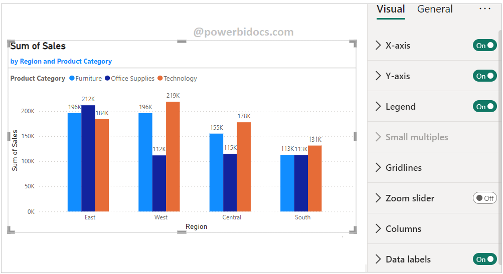
Step-2: Click anywhere on the Clustered Column Chart, then drag the required columns to the Fields Section. Refer to the image below for a visual reference.
- X-axis: ‘Region’
- Legend: ‘Product Category’
- Y-axis: ‘Sales’

Required Fields descriptions
- X-axis: Specify the Column that represent the Vertical Bars.
- Legend: Display grouped by category data series as in Vertical Bars.
- Y-axis: Any Numeric value such as Sales amount, Total Sales etc.
How to formatting Clustered Column Chart?
Select the chart > Click on “Format your visual tab”> From there, you can manage the properties listed below:
Visual Tab:
X-axis : Mange the X-axis Value font size, color & Title.
Y-axis: Mange the Y-axis Value font size, color, Title, Display Unit etc.
Legend: Specified the Legend Text color, font size, Position & Title.
Columns: Change the color of chart & maintain the spacing between columns.
Data Labels: Enable the data labels on chart, manage the display unit of labels
General Tab:
Properties: In this section you can manage the chart height, width, horizontal & vertical position.
Title: Under general tab you can see the title section> Here you can set the below properties-
-
-
- Title- Specified the title for chart, & manage the font size, color, background for chart.
- Subtitle- Specified the subtitle for chart, & manage the font size, color, background for chart.
- Divider- Enable the line between Title & chart.
- Spacing- Manage the space between title, Subtitle & chart area.
-
Key features of a Clustered Column Chart in Power BI include:
- Categorical Comparison: Each column on the chart represents a specific category, and the height of the column corresponds to the value of the data category.
- Grouped Columns: Columns are grouped side by side for each category, allowing easy visual comparison between categories.
- Axis Labels: The x-axis typically represents the categories, and the y-axis represents the values.
- Color Coding: Different categories are often represented using distinct colors for better differentiation.
- Legend: The legend identifies the categories and their corresponding colors.
- Tooltip: Hovering over a column provides detailed information about the value it represents.
Refer- How to create small multiples chart
Hope you enjoyed the post. Your valuable feedback, question, or comments about this post are always welcome or you can leave us message on our Contact form , we will revert to you asap.
![]()