
Power BI Stacked Column Chart & Stacked Bar Chart both are most usable visuals in Power BI.
Stacked Column Chart is useful to compare multiple dimensions against a single measure.
In a stacked column chart, the vertical axis represents the numerical values of the data, while the horizontal axis displays the categories or time periods.
Stacked column charts are useful for comparing the total values of different groups, as well as for identifying the contribution of each group to the overall total.
Download Sample data :
Let’s begin with an example
Go to the Home tab > Under Insert section> choose Stacked Column Chart from visualization pane.

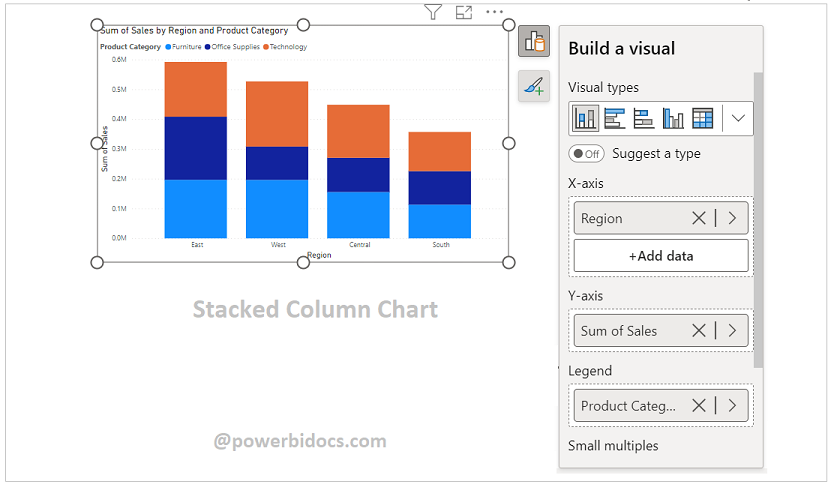
You can see a blank Stacked Column Chart visual, you can add data to the visual by clicking on the first icon.

Add the fields to the visual
X-axis: Add Region, Y-axis: Sales & Legend: Product Category
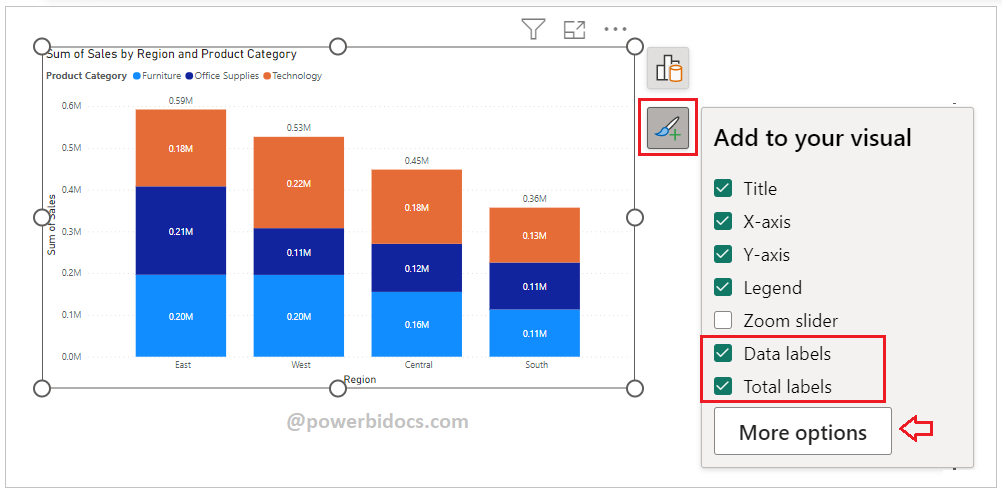
If you want to perform some quick operation such as add or remove the elements from visual, click on Format Icon and you can enable Data Labels & Total Labels for Stacked Column Chart
Add if you want to access more formatting options click on More Option button.
How to formatting Stacked Column Chart?
Select the chart > Click on “Format your visual tab”> From there, you can manage the properties listed below:
Visual Tab:
X-axis : Mange the X-axis Value font size, color & Title.
Y-axis: Mange the Y-axis Value font size, color, Title, Display Unit etc.
Legend: Specified the Legend Text color, font size, Position & Title.
Columns: Change the color of chart & maintain the spacing between columns.
Data Labels: Enable the data labels on chart, manage the display unit of labels
Total Labels: Enable Total labels on chart.
General Tab:
Properties: In this section you can manage the chart height, width, horizontal & vertical position.
Title: Under general tab you can see the title section> Here you can set the below properties-
-
-
- Title- Specified the title for chart, & manage the font size, color, background for chart.
- Subtitle- Specified the subtitle for chart, & manage the font size, color, background for chart.
- Divider- Enable the line between Title & chart.
- Spacing- Manage the space between title, Subtitle & chart area.
-

Key features of a Stacked Column Chart in Power BI include:
- Multiple Categories: The x-axis typically represents the different categories, and the subcategories within each column represent the different components.
- Stacked Segments: Each column is divided into segments that represent the individual subcategories. The height of each segment indicates the value or proportion of that subcategory.
- Color Coding: Different subcategories are often represented using distinct colors for easy differentiation.
- Legend: The legend is used to identify the different subcategories.
- Tooltip: Hovering over a segment provides detailed information about the value it represents.
How to enable Total values for Stacked Chart Visual( Applicable for Old version, prior 2022)?
Refer this : Turn on Total labels for Stacked Chart
Hope you enjoyed the post. Your valuable feedback, question, or comments about this post are always welcome or you can leave us message on our contact form , we will revert to you asap.
Recommended Post:
![]()