
Power BI Donut chart(Doughnut chart) is similar to a pie chart in that it shows the relationship of parts to a whole, where all pieces together represent 100%.
Donut Chart in Power BI Desktop charts are useful when you want to display small categories of data & avoid for many categories, or when categories do not sum to 100%.
Note:
- Learn :- Get data from Excel to Power BI
- Download Sample Dataset: Excel Sample Dataset for practice
So, let’s begin with an example-
Step-1: Add a Donut Chart from the Visualization Pane to the Power BI Report page.
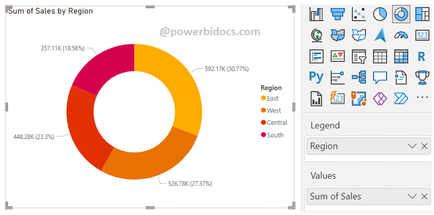
Step-2: Click anywhere on the Donut Chart, then drag the required columns to the Fields Section. You can refer to the image below for a visual reference.
- Legend: ‘Region’
- Value: ‘Sales’
Step-3: The Donut chart offers various label content options, including:
- Category
- Data Value
- Percent of total
- Category, data value
- Category, percent of total
- Data value, percent of total
- All details labels
Here are a few examples of label contents:
Label contents: Category, percent of total

Label Style : All details labels

How to format Donut Chart?
Select the chart > Click on “Format your visual tab”> From there, you can manage the properties listed below:
General Tab
Properties: In this section you can manage the chart height, width, horizontal & vertical position.
Title: Under general tab you can see the title section> Here you can set the below properties-
-
-
-
- Title- Specified the title for chart, & manage the font size, color, background for chart.
- Subtitle- Specified the subtitle for chart, & manage the font size, color, background for chart.
- Divider- Enable the line between Title & chart.
- Spacing- Manage the space between title, Subtitle & chart area.
-
-
Visual Tab
- Legend: Allows you to set position, Legend name, color, font size, font family.
- Slices: Using this section you can change the colors used for each series in the chart. Also you can manage the spacing of inner radius.
- Detail labels: Its enable values on chart & you can change Label style, color, background color, display unit and many more of Data labels.
- Rotation: You can rotate the slices of donut chart.
Key features of the Donut Chart in Power BI include:
- Circular Representation: The chart is displayed in a circular shape with a hole in the center, forming a ring-like appearance.
- Category Proportions: Each segment of the donut represents a different category, and the size of each segment corresponds to its proportion within the total.
- Labeling Options: Labels can be added to the segments, showing category names, values, percentages, or combinations of these.
- Interactive: Donut charts can be interactive, allowing users to click on segments to drill down into more detailed data or to emphasize a specific category.
- Colors: Different colors are used to distinguish between segments, making it easy to identify and differentiate categories.
Hope you enjoyed the post. Your valuable feedback, question, or comments about this post are always welcome or you can leave us message on our Contact form , we will revert to you asap.
![]()