
Power BI Line chart is used to show change or trends over a period of time. This chart is particularly effective for showing trends over time and highlighting changes in data values.
Refer- How to create small multiples chart
Let’s start with an example
Step-1:Download Sample data : SuperStoreUS-2015.xlxs
Step-2: Add a Line Chart to the Power BI Report page.
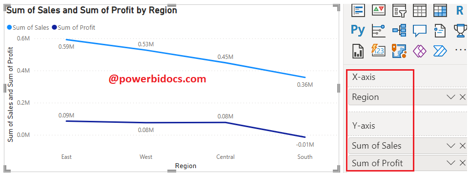
Step-3: Click anywhere on the Line Chart, then drag the required columns to the Fields section. You can refer to the image below for a visual reference.
- X-axis: ‘Product Category’
- Y-axis: ‘Sales’ & ‘Profit’
How to format Line Chart?
Select the chart > Click on “Format your visual tab”> From there, you can manage the properties listed below:
General Tab
Properties: In this section you can manage the chart height, width, horizontal & vertical position.
Title: Under general tab you can see the title section> Here you can set the below properties-
-
-
-
- Title- Specified the title for chart, & manage the font size, color, background for chart.
- Subtitle- Specified the subtitle for chart, & manage the font size, color, background for chart.
- Divider- Enable the line between Title & chart.
- Spacing- Manage the space between title, Subtitle & chart area.
-
-
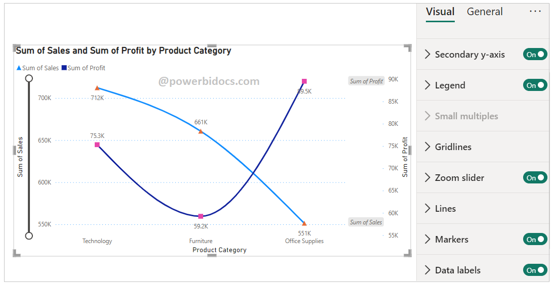
Visual Tab
- X-Axis: Set the font size, font family, color and title for x-axis.
- Y-Axis: Set the font size, font family, color and title for y-axis.
- Secondary Y-axis: Set the font size, font family, color, display units & title for secondary y-axis.
- Lines: Under line section you can manage the following properties:
- Data colors: Using this section you can change the colors used for each series in the chart & customize the all line color individually.
- Shapes: You can enable markers on Line & customize the marker shapes for all lines individually.
- Data labels: Its enable values on Line chart.
- Markers: Using this you can enable markers on line & customize the marker shapes & color for all lines individually.
- Series labels: Display the series labels on the visual.
- Zoom Slider: Enables zoom feature on chart, using this you can easily saw the small values on chart.
Key features of a Line Chart in Power BI include:
- Time-Series Analysis: Line charts are often used to visualize data over time, making them suitable for tracking trends, patterns, and changes.
- Data Comparison: Line charts are valuable for comparing multiple data series and understanding how they relate to each other.
- Connected Data Points: Each data point is connected with a line, helping to visualize the continuity of data trends.
- Axis Labels: The x-axis represents time or another continuous variable, while the y-axis represents the values.
- Data Points: Data points can be emphasized with markers, making them more prominent.
- Color Coding: Different line series are typically displayed using distinct colors for easy differentiation.
- Legend: The legend helps identify the line series and their corresponding colors.
- Tooltip: Hovering over a data point provides detailed information about the value it represents.
Hope you enjoyed the post. Your valuable feedback, question, or comments about this post are always welcome or you can leave us message on our contact form , we will revert to you asap.
Recommended Post:
![]()