
The Hierarchy Chart is used to displays hierarchical data in a tree format. It is custom visual and certified by Microsoft Power BI.
Let’s Get started
Firstly, prepare the dataset as in hierarchical way, see the dataset as given below:-
| CustId | Dept | Customer | Parent Id |
| 1 | Manager | Sandeep Raturi | |
| 2 | Team Lead | Antonio Moreno | 1 |
| 3 | Team Lead | Aria Cruz | 1 |
| 4 | Team Lead | Dinesh Raturi | 1 |
| 5 | Developer | Matt | 4 |
| 6 | Developer | Jhon | 4 |
| 7 | Developer | Jacobs | 2 |
| 8 | Developer | David | 3 |
Now follow these steps in order to create a Hierarchy chart:-
Step-1: Click on ellipsis icon under Visualization Pane > then click on Get more visuals.

Step-2: After that one pop-up window will be open, enter your power bi account mail id & password. If you already logged In into power bi desktop then this window will not come.
Step-3: After logged In, you will see the Power BI visual pop-up window. Now follow these steps-
Under AppSource Tab > Select Category “All” > Search for “Hierarchy chart” > Click on Add button

Step-4: Visual imported successfully, now drag visual & columns to report page.

Format the Hierarchy Chart
Select the visual and go to format bar & follow these properties-
General: Allows you to set X axis, Y axis, width & height for chart.
Levels: Here, you can mange the controls(+,-) for chart and can set the depth control for chart.

Types Colors: Change the colors for levels

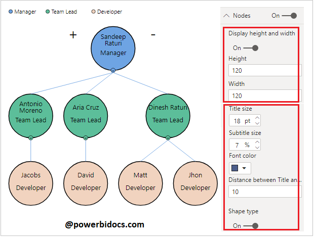
Nodes: Allows you to set the height, width, font color, font size for levels, also you can change the shape of hierarchy.
Legend: Set legend Title, Font color, Text size & Position for legend.
Links: Change the link colors of nodes.
Collapse & Expend the Hierarchy Levels
You can Show & hide the level of Hierarchy to click on + & – Icon.

Want to know about other visuals, refer this: Power BI Visualizations
Hope you enjoyed the post. Your valuable feedback, question, or comments about this post are always welcome or you can leave us message on our Contact form , we will revert to you asap.
![]()
Is it possible to rotate the nodes? I’m getting nodes with vertical text by default, and I do not know how to change it. Thanks!