
The Table Heatmap visual is a great way to compare data values easily and intuitively. You can create a Table Heatmap in Power BI by using conditional formatting on the Matrix visual.
So, let’s start with an example; download the sample dataset from the link below
Let’s get started-
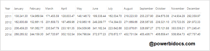
Step-1: Add a Matrix visual to the Power BI report page and drag the year, month, and sales columns into the fields section.

Step-2: Select the Matrix visual and go to the format bar, then follow these steps:
- Style – Select None.
- Grid – Turned on Horizontal & Vertical grid, and choose some light grey color for Horizontal & Vertical grid color. And give Row padding 5px.
- Increase the font size for – Column header, Row header & Values.
- Subtotals – Turned off Row Subtotals & Column subtotals.
After implementing all the above things, your visual should look like the one below:
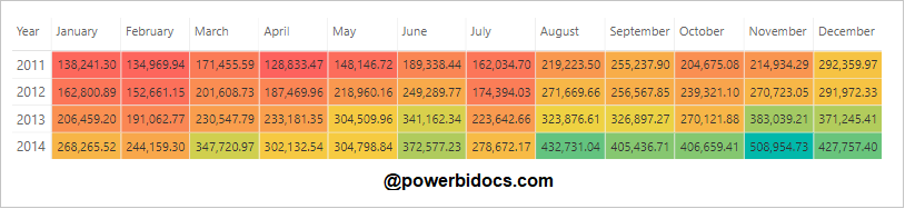
Step-3: Right-click on the Sales column, choose Conditional Formatting, and click on Background Color.

Step-4: The background color windows dialogue box opens. Now, click on the Diverging checkbox and assign colors for minimum, center, and maximum values.

Step-5: see the output, Table heatmap has been ready.
How to hide sale values on visual?
Follow these steps in order to hide values on visual –
Step-1: Follow the step number-3, Right click on Sales column > Choose condition formatting > click on Font color.
Step-2: Choose same color which you select for Background color, follow step number-4.
Step-3: See the final output-

Refer other Power BI topics: Power BI tutorials
Hope you enjoyed the post. Your valuable feedback, question, or comments about this post are always welcome or you can leave us message on our contact form , we will revert to you asap.
![]()