
A Gantt chart is a simple project management tool that shows a project’s schedule over time. It uses bars to represent tasks, where each bar’s position and length show the task’s start date, duration, and end date.
This helps teams easily see deadlines, track progress, and understand how different tasks depend on each other.
Uses of a Gantt Chart:
- Visualizing project timelines and milestones.
- Tracking task progress and deadlines.
- Identifying task dependencies and overlaps.
- Managing team workload and resource allocation.
- Improving communication and collaboration on project status.
Download Project Tasks Dataset: Project Tasks
View of Dataset:

Step-by-Step Guide to Create a Gantt Chart in Power BI:
Step-1: Load the Dataset: Go to Home > Get Data > Select Text/CSV, and load the Project Tasks dataset into Power BI.
Step-2: Import the Gantt Chart Visual:
Click on the ellipsis icon under Visualization Pane >, then click on Get more visuals. (Make sure you logged in to Power BI desktop.)

Search for “Gantt Chart” and choose the Gantt by Microsoft Visual (a popular custom visual).
Click Add to import it into your report.

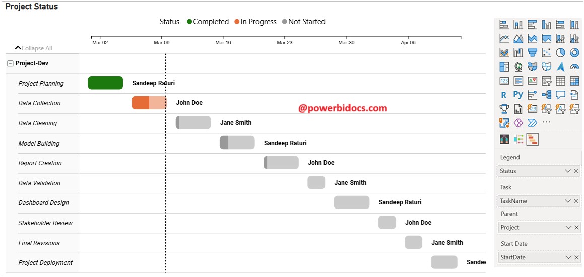
Create the Gantt Chart:
Drag the Gantt chart visual onto the report canvas.
Add the following fields from the “ProjectTasks” table:
Legend: Status
Task: TaskName
Parent: Project
Start Date: StartDate
End Date: EndDate
% Completion: Progress(%)
Resource: AssignedTo
Tooltip: Priority
Format the Chart:
- Go to the Format pane and adjust colors, labels, and gridlines as needed.
- Turn on Data Labels to show task details.
- Adjust the Timeline to display days, weeks, or months based on project duration.

Thanks for reading this post! I hope you found it helpful. Feel free to share it with others or your teammates so they can benefit from it too. 😊
![]()