
In Power BI, you can dynamically change the visual value based on slicer value selection.
Requirement-
Suppose you have three measures – Sales, Profit, and Discount, and the user/client wants to view only one selected slicer measure value on the visual (one measure value at a time).
Expected output-

Let’s understand how you can be achieve this-
Download the sample Dataset from below link-
Now follow these steps in order to achieve this-
Step-1: Create a static table, and follow the below steps-
Under the Home tab, click on the Table icon to open the table dialog box.
Change the column header name by double-clicking on the header name and entering the new name. After that, enter the measure name row by row.
Provide a table name and click on the Load button.

Step-2: Now, add a slicer visual to the report page and drag the ‘Type’ column from the static table into the slicer.

Step-3: Then, configure the properties for the slicer below.
Visual tab:
- Style: Choose the style “Tile”.
- Selection controls: Turn on Single select
- Selection header: Turn off selection header
- Values: Allows you to set the font size, font family, color & background color for Text.
General Tab: Go to the Advance Option, and Turned on the Responsive button.

Step-4: Create a dynamic measure for tracking changes in value.
Right-click on the dataset name > Select New measure > Enter the DAX code below.
Total Amount =
VAR TotalSales = SUM ( 'Global-Superstore'[Sales] )
VAR TotalProfit = SUM ( 'Global-Superstore'[Profit] )
VAR TotalDiscount = SUM ( 'Global-Superstore'[Discount] )
VAR SelectMeasure =
SELECTEDVALUE ( Navigation[Type] )
RETURN
IF (SelectMeasure = "Sales",TotalSales,
IF (SelectMeasure = "Profit",TotalProfit,
IF (SelectMeasure = "Discount",TotalDiscount,
BLANK ()
)))
Measure Description:
- Write DAX to get Total Sales, Profit & Discount and store all three calculation into three separate variables.
- Store Slicer selected value into variable “SelectMeasure”, Navigation is Static table name & Type is column name.
- Use IF condition, Passed measure variable name into condition based on selected values.
Step-4: Add a clustered column chart to the report page and drag the Region column to the X-Axis and the measure to the Values section.
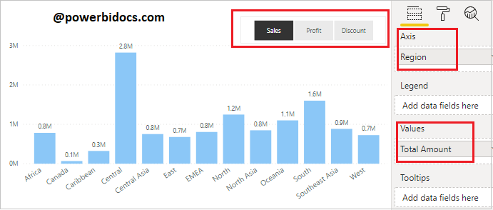
Now, it will dynamically change the visual value based on slicer selection.
Refer Power BI other post: Power BI tutorials
Hope you enjoyed the post. Your valuable feedback, question, or comments about this post are always welcome or you can leave us message on our Contact form , we will revert to you asap.
![]()
Yes basically we can create a parameter table hosting the options with datatable, no need for relationship with other tables.
Have your measures ready for each option and then use SWITCH and SELECTEDVALUE together and nest your measures inside.
This video explains it in two ways thoroughly
wonderful video brother