
Learn how to display a ‘Data not exist’ message in a Power BI chart visual when data is missing. In this post, I’ll guide you through the steps to accomplish this
Expected output-

Let’s get started-
Sample dataset as below for this practical-
Table name – SalesData

| Year | Sale |
| 2010 | 100 |
| 2011 | 90 |
| 2012 | |
| 2013 | |
| 2014 | |
| 2015 | 700 |
| 2016 | 100 |
| 2017 | 230 |
| 2018 | 90 |
| 2019 | 100 |
| 2020 | 200 |
Before proceeding, let’s take a look at how the visual appears without a message when the data is blank.
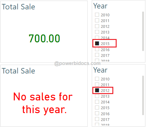
In the dataset, there are no sales for the years 2012, 2013, and 2014. When we select Year 2012 in the Year slicer, you’ll notice the output of the card visual displaying blank text.

Now, let’s proceed with implementing a custom text message when data is not available. Follow these steps:
Step-1: Load above sample dataset into Power BI and take two visuals-
- Card visual – Drag Sale column
- Slicer – Drag year column
Step-2: Create a measure for custom text if sales is blank, for this write below DAX code.
TotalSales_1 =
Var GetSale = SUM(SalesData[Sale])
Return
If(ISBLANK(GetSale),"No sales for this year.", GetSale)
Now drag this measure to card visual, and see the output-

Change Text message font color “Red” when no data exist-
Step-1: Create a new measure and enter the following DAX code-
Change color =
IF(ISBLANK(SUM(SalesData[Sale])),
"#FF0000", --Red color
"#008000"-- Green color
)
Step-2: Select card visual > go to format bar > under callout value, click on Fx icon.

Step-3: The Color Conditional Formatting dialog box opens. > Then, select the format type as “Field value,” and choose the measure from the “Based on field” drop-down. Finally, click the OK button.

Step-4: Now select year 2012 from year slicer and see the output-
Implement the same for other visuals-
Step-1: Add a clustered column chart to your Power BI report page and drag the “Year” and “Sales” columns into the fields section.

Step-2: Create a measure for custom message, write below DAX.
TotalSales_2 =
Var GetSale = SUM(SalesData[Sale])
Return
If(ISBLANK(GetSale),"No sales for this year.", "")
This DAX expression is slightly different from the one used for the card visual. If the sales data is blank, the expression will return a message; otherwise, it will return nothing.
Step-3: Now, place a card visual on top of the clustered column chart and add this measure to the fields section of the card visual.
Disable the card visual’s title, border, background, and category properties.

Step-4: Select card visual > go to format bar > under callout value, click on Fx icon.
Step-5: Color dialogue box opens, then select format type- Field value > then select measure(change color) in Based on field drop-down > click on OK button (Ref :- see step no 2 & 3 of card visual).
Step-6: See the output-

Refer more DAX functions- DAX Tutorials
Hope you enjoyed the post. Your valuable feedback, question, or comments about this post are always welcome or you can leave us message on our contact form , we will revert to you asap.
![]()
How to display Card “Truly Blank Text Field” when (Blank) until selection is made and / or when Multi-selections have been made? “Region Name”
Let’s say we are copy pasting city names from excel directly into Power BI custom filter box to display respective city revenue. In this scenario, how to display a message “Data unavailable for X, Y, Z” cities?
How do you make it to show those years with no sales data as 0 on the graph?
Can we display a text message Loading & Loaded while loading icon rotates in Power BI dashboard.
How to display the “No data found” with the grey background box, when there is no data available? when there is data background box should be transparent, I have explored conditional background its not helping me out to display transparent background when there is a data Please help me with it
Thanks Advance