
In this blog, you will gain comprehensive insight into the “Conditional Formatting for Data Labels” feature within Power BI.
The Microsoft Power BI team introduced the “Conditional Formatting for Data Labels” feature as part of the August 2022 updates.
Using this feature you can apply the conditional formatting for data labels of visuals.
Where you can find the conditional formatting options?
Select the visual > Go to the formatting pane> under Data labels > Values > Color
Let’s Get Started-
Add a line chart visualization to the page and establish two measures for Profit and Sales.
Note: If you don’t want to create measure then you can directly use Sales and Profit fields.
Total Profit = SUM(financials[Profit])
Total Sales = SUM(financials[ Sales])

Apply Conditional formatting for Data Labels
Example-1: Conditional formatting based on Rules
Step-1: Select the visual >go to the format pane>Data Labels.
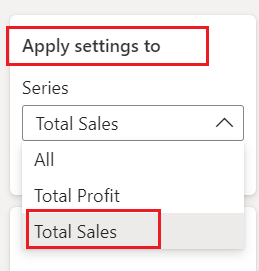
Step-2: Choose measure from “Apply settings to”.
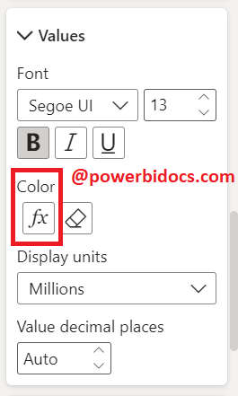
Step-3: Go to Values> Click on fx icon.
Step-4: Choose Format Style – Rules and Select measure name. After that add rules condition, see the below given screen shot.

Step-5: You can apply the same steps to other measures. As shown in the final screenshot below, the data labels color has been changed according to the set conditions.

Example-2: Conditional Formatting based on Gradient
Step-1: Select the visual >go to the format pane>Data Labels.
Step-2: Apply settings to – All
Step-3: Go to Values> Click on fx icon.
Choose the ‘Gradient’ format style, where you can define three colors for the lowest, middle, and highest values. Then, click ‘OK’.

Additionally, you can select the ‘Custom’ option to input a custom value. For example, click on the ‘Lowest Value’ dropdown menu, choose ‘Custom,’ and then enter a value
Step-4: See the result of Gradient conditional formatting-

I hope you understand how to set conditional formatting for data labels.
![]()