In Power BI, you can create a KPI indicator using SVG (Scalable Vector Graphics) image code.
Note: SVG is a vector graphic format based on XML and is used to display a variety of graphics on the Web and in other environments.
Refer other KPIs post: KPI Card visual, Multi KPI custom visual
Let’s get started
Download the sample Dataset from below link-
Text SVG Image code
SVG Code for Text:-
<svg xmlns='http://www.w3.org/2000/svg' viewBox='0 0 100 100'>
<text x='10' y='50' fill='red' transform='rotate(30 20,40)' font-size='30' font-family='Verdana'>Write Text here</text>
</svg>
Now follow these steps to create a TEXT SVG image KPI:-
Step-1: Create a measure with below code.
SVG_Text =
Var TotalProfit= SUM('Global-Superstore'[Profit])
Var Loss_SVG_Text =
"data:image/svg+xml;utf8," &
"<svg xmlns='http://www.w3.org/2000/svg' viewBox='0 0 100 100'>
<text x='10' y='50' fill='red' transform='rotate(30 20,40)' font-size='30' font-family='Verdana'>Loss</text>
</svg>"
Var Profit_SVG_Text=
"data:image/svg+xml;utf8," &
"<svg xmlns='http://www.w3.org/2000/svg' viewBox='0 0 100 100'>
<text x='10' y='50' fill='green' transform='rotate(30 20,40)' font-size='30' font-family='Verdana'>Profit</text>
</svg>"
Return
If(TotalProfit<0, Loss_SVG_Text, Profit_SVG_Text)
Measure Description:
- If Profit is less than 0 then display “Loss” text with red color else display “Profit” text with green color
- data:image/svg+xml;utf8 – Prefix the SVG with code to declare that it is an SVG image.
Step-2: Now change the measure Data category-
Select measure > Click on Measure tools > Choose Image URL from Data category dropdown.

Step-3: Now drag measure to Table visual and see the output.

Circle Dot SVG Image code
Step-1: Create a measure with below code.
SVG_Circle =

Var TotalProfit= SUM('Global-Superstore'[Profit])
Var Red_SVG = "data:image/svg+xml;utf8," &
"<svg xmlns='http://www.w3.org/2000/svg' viewBox='0 0 100 100'>
<circle cx='50' cy='50' r='30' fill='red' />
</svg>"

Var Green_SVG = "data:image/svg+xml;utf8," &
"<svg xmlns='http://www.w3.org/2000/svg' viewBox='0 0 100 100'>
<circle cx='50' cy='50' r='30' fill='green' />
</svg>"

Return
If(TotalProfit<0, Red_SVG, Green_SVG)
Step-2: Then change the Data category( image URL) for that measure.
Up arrow & Down arrow SVG image code
Step-1: Create a measure with below code
SVG_Arrow =

Var TotalProfit= SUM('Global-Superstore'[Profit])
var uparrow = "data:image/svg+xml;utf8," &
"<svg xmlns='http://www.w3.org/2000/svg' viewBox='0 0 100 100'>
<path d='M10 90 L50 10 L90 90 Z' fill='green' />
</svg>"

var downarrow = "data:image/svg+xml;utf8," &
"<svg xmlns='http://www.w3.org/2000/svg' viewBox='0 0 100 100'>
<path d='M10 10 L50 90 L90 10 Z' fill='red' />
</svg>"

Return
If(TotalProfit<0, downarrow, uparrow)
Step-2: After that, change the Data category( image URL) for this measure.
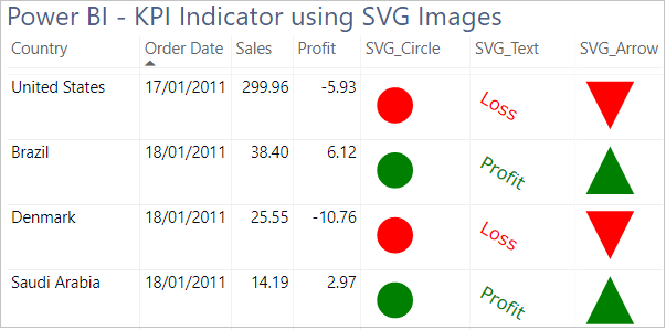
Now drag all measures to Table visual and see the final output
Refer other KPIs post: KPI Card visual, Multi KPI custom visual, Other Power BI Tutorials
Hope you enjoyed the post. Your valuable feedback, question, or comments about this post are always welcome or you can leave us message on our Contact form , we will revert to you asap.
![]()