
Power BI, the Analytics pane is very cool feature in order to add dynamic reference lines to visuals and provide focus for important trends or insights.
The Analytics icon and pane comes under Visualization area of Power BI Desktop.
Dynamic reference lines supported by Analytics pane:
using Analytics pane, you can create the following types of dynamic reference lines-
- X-Axis constant line
- Y-Axis constant line
- Min line
- Max line
- Average line
- Median line
- Percentile line
- Symmetry shading
Let’s understand with an example:
Step-1: Download Sample data : SuperStoreUS-2015.xlxs
Step-2: Import Excel file to Power BI Desktop, Example:- Import file in Power Bi
Step-3: Now take Line visual to Power BI page and drag Region & Sales columns from Orders dataset to Fields section.
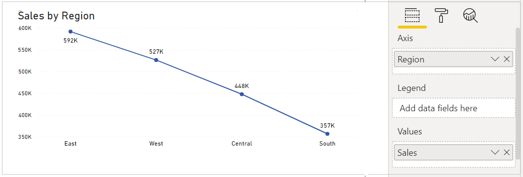
Step-4: Let’s see Dynamic references lines for Line chart-
Double click on chart, then click on Analytics icon under Visualization pane.

Step-5: Here, you have six types of line references available for Line chart, let’s start with MIN, MAX & Average line.
Descriptions:
- MIN : It draw a line on the basis of Min value
- MAX: It draw a line on the basis of MAX value
- Average: It draw a on the basis of Average of value
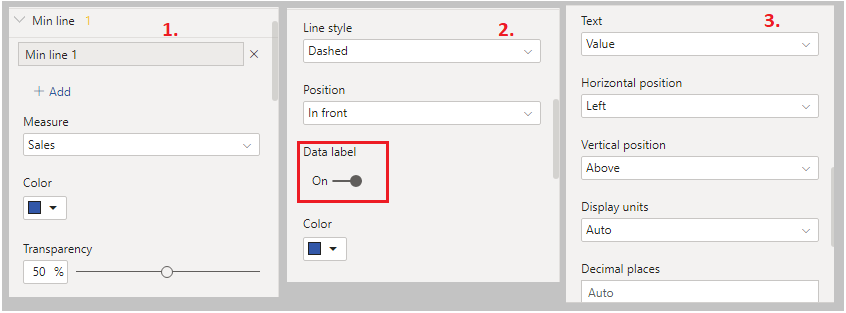
Step-6: Now expend Min Line & click on Add button.

Step-7: After click on add button, one Min line appears on your line chart visuals, now you can set Min line properties like, Line color, Data labels color, position & Display Unit etc.
Step-8: Follow the Step No 6 & 7 for MAX, Average & Constant lines, see the final output as below.

Limitation of Dynamic references lines
Note : Reference from Microsoft Docs site
You may use x-axis constant line, y-axis constant line, and symmetry shading on the following visual:
- Scatter chart
You can use constant line, min line, max line, average line, median line, and percentile line is available on these visuals:
- Area chart
- Clustered bar chart
- Clustered column chart
- Line chart, Scatter chart
The following visuals can use only a constant line from the Analytics pane:
- Stacked area chart
- 100% Stacked bar chart
- Stacked column chart
- 100% Stacked column chart
- Stacked bar chart
- Waterfall chart
The following visuals can use a trend line if there’s time data:
- Area chart
- Clustered column chart
- Line chart
- Line and clustered column chart
Hope you enjoyed the post. Your valuable feedback, question, or comments about this post are always welcome or you can leave us message on our contact form , we will revert to you asap.
![]()